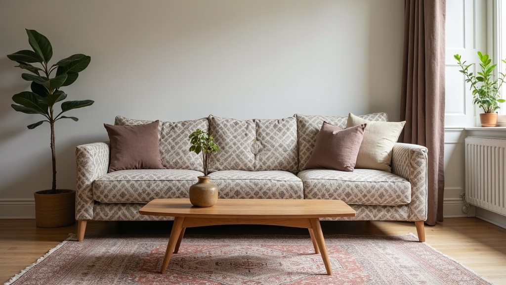
The short answer: choose one dominant pattern and let the other play a supporting role, keep the busier of the two elements in the smaller-scale motif, and connect them with a shared color rather than a matching print. A rug with a bold, large-scale design almost never sits well under a sofa with an equally bold print — the room needs one focal pattern and one quieter partner, and which one takes the lead is a decision you make on purpose, not by accident.
Why two patterns fight in a room
Pattern reads as visual weight. When a rug and a sofa are both busy, the eye has nowhere to rest and the room feels restless even if every individual piece is attractive. This is the same principle covered in our broader guide to choosing between a patterned or solid rug: pattern draws attention downward or upward depending on scale, and a room can usually only support one strong pull at a time. With patterned furniture already in place, the rug’s job shifts from “make a statement” to “hold the room together” — which is a different design problem than picking a rug for a plain sofa.
Start with scale, not color
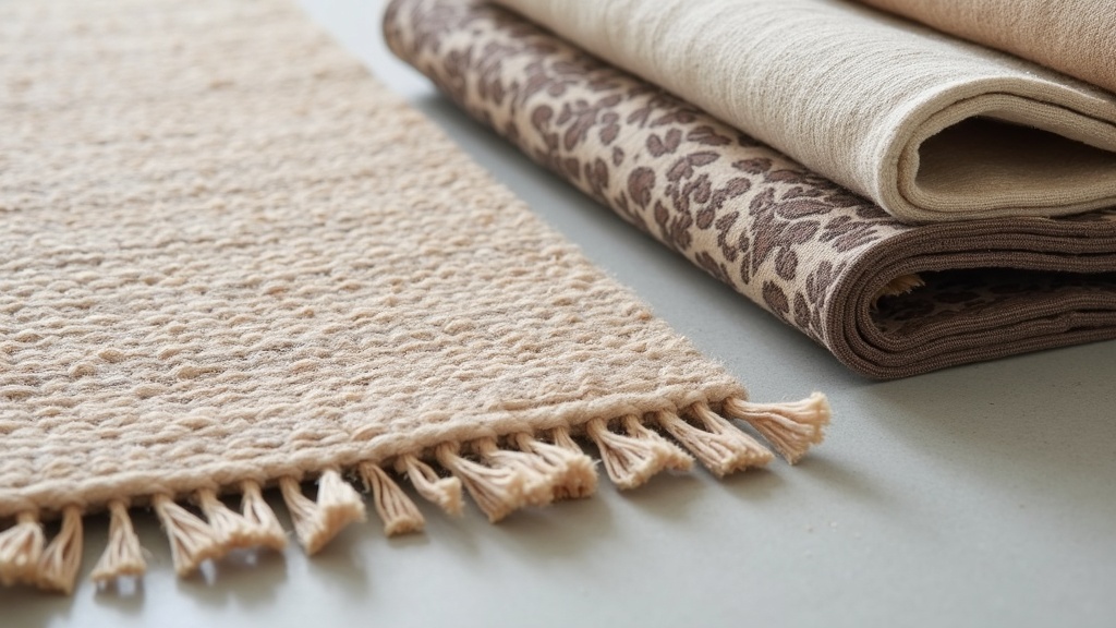
Before you think about which colors go together, look at the size of the repeat in each pattern. A sofa with a small, tight geometric weave — houndstooth, a fine check, a subtle jacquard — leaves room for a rug with a larger, more open design underneath it. A sofa with an oversized floral or a bold ikat print needs a rug that steps back: something with a tighter, denser motif, a tonal pattern, or a design read mostly from a distance as texture rather than shape.
This is why so many rooms with patterned furniture end up with a Persian or Caucasian-style rug rather than an equally graphic contemporary print. Traditional medallion and allover designs, discussed in more depth in our piece on rug motifs like medallions, boteh, and herati, are built from small repeating units. Seen from across a room they behave almost like a textured solid, which gives a busy sofa somewhere to land without a second competing pattern in the mix.
A simple way to test scale on paper
- Photograph the furniture’s fabric and a candidate rug from the distance you’d actually view them from in the room, not up close.
- Shrink both images to the same small size on a screen. If either pattern still reads as a busy jumble at that size, it’s likely to feel busy in the room too.
- Compare the “grain” of each pattern — an allover small-scale rug motif almost always calms a large-scale upholstery print better than a rug pattern the same size as the furniture’s.
Three approaches that actually work
| Approach | How it works | Best for |
|---|---|---|
| Pattern hierarchy | One dominant pattern (usually the furniture, since it’s larger and closer to eye level), one quiet supporting pattern in the rug | Rooms already built around a statement sofa or armchairs |
| Shared color, different pattern | Rug and furniture pull from the same palette but use unrelated motifs and different scales | Rooms with a strong existing color scheme you don’t want to disturb |
| Neutral ground, pattern accents | A low-contrast, mostly tonal rug lets patterned cushions, throws, and furniture do the visual work | Smaller rooms or anyone unsure about mixing two patterns confidently |
None of these is objectively correct — they’re trade-offs. Pattern hierarchy gives the most visual interest but takes the most confidence to get right. A neutral ground is the safest route and works well in a room built around restraint, but it can feel flat if the rest of the room is already quiet too. Shared color is the middle path most decorators lean on when they’re not sure, because color does the connecting work that pattern-matching would otherwise have to do.
Color is the real connector
Two unrelated patterns can sit comfortably in the same room as long as they share at least one color in similar intensity — not necessarily the dominant color of either piece, but a secondary or accent shade that appears in both. A rug with rust, navy, and cream can pair with a sofa in a completely different floral or trellis print, provided one of those three colors shows up somewhere in the upholstery, even as a thin piping or a single flower center. Without that shared thread, two patterns tend to look like they arrived from different houses. Our guide on choosing a rug colour that won’t date covers how to pick anchor colors that stay flexible if the furniture changes down the line — worth reading before committing, since a rug is usually the more expensive and longer-lived piece to replace.
Where this goes wrong
- Two dominant patterns of similar scale. A large medallion rug under a large-print sofa, even in a beautiful shared palette, usually reads as cluttered because nothing signals which pattern to look at first.
- Matching rather than pairing. A rug printed with the exact motif from the curtains or cushions can feel like a themed set rather than a considered room — coordinated is not the same as identical.
- Ignoring undertone. A warm rust rug can clash with a cool-toned patterned sofa even when both are technically “red,” because the underlying warmth or coolness of a color matters as much as the hue name.
Construction matters as much as pattern
Before you fall for a particular design, it’s worth understanding what you’re actually buying, since pattern and construction are linked. Dense, small-scale traditional patterns are usually achieved through hand-knotting, which allows fine detail per square inch; large bold graphic patterns are often produced on power looms or as hand-tufted rugs, where the technique naturally favors bigger, simpler shapes. Neither is inherently better — a hand-tufted rug can be a practical, budget-friendly choice for a household with patterned furniture that’s likely to change again in a few years, while a hand-knotted rug is a longer-term investment better suited to a room you’re not planning to redecorate soon. If you’re weighing this decision, the rug buying guides hub and the styles and patterns archive both go deeper into how construction, price, and pattern complexity relate to each other.
Living with pattern-on-pattern: a fibre safety note
Rooms with patterned furniture near a patterned rug often see more entertaining, more foot traffic, and more spilled wine or coffee on both surfaces — which makes fibre matters, not just design ones. If a spill lands on a wool rug, blot it immediately with a clean white cloth and cool water, using a small amount of a pH-neutral, wool-safe detergent if needed, and always test on a hidden corner first. Never use chlorine bleach on wool or silk — it will damage the fibre and can strip or shift the dye. Hot water and high-alkaline cleaners cause wool to felt, shrink, and yellow, so stick to cool water only. Silk rugs and richly dyed pieces with natural or early synthetic dyes are a different matter entirely: water and most household detergents can cause bleeding or permanent staining, and a hand-knotted, antique, silk, or otherwise valuable rug should go to a professional rug cleaner or conservator rather than be treated at home. Never mix cleaning chemicals — combining products like bleach and ammonia produces dangerous fumes and won’t lift a stain any better than one product used correctly. For everyday maintenance, our cleaning and stains archive covers specific spill types in more detail.
Frequently asked questions about pairing a rug with patterned furniture
Can you put a patterned rug with a patterned sofa?
Yes, as long as one pattern is clearly the dominant one and the other is smaller in scale or lower in contrast. Anchor them with a shared color, and avoid two large-scale, high-contrast patterns competing at the same visual weight in the same room.
What rug goes with a floral sofa?
A rug with a tight, allover traditional motif — a small-scale medallion, herati, or geometric tribal pattern — usually works better than another floral. It reads as texture from a distance and lets the sofa’s floral print remain the room’s focal pattern.
Should the rug or the furniture be the bolder pattern?
Either can lead, but pick one on purpose. Furniture is at eye level and easier to notice first, so it often works well as the dominant pattern, with the rug as a quieter, supporting layer underfoot.
How do I match colors between a patterned rug and patterned furniture without them clashing?
Look for one shared accent color between the two, in a similar warmth or coolness of tone, even if it’s a minor color in each piece. That shared thread lets the patterns differ freely while the room still feels coordinated rather than random.
Is a solid rug safer than a patterned one with patterned furniture?
A solid or tonal rug is the lowest-risk choice and works well if you’d rather the furniture carry all the visual interest. It’s not “correct,” just simpler — a subtle pattern can still add depth without competing, if the scale is kept small.
Rug Academy publishes general information about rugs and is not a dealer, appraiser, or cleaning service. Cleaning and repair methods depend entirely on fibre, dye and construction — test any treatment on a hidden corner first, and consult a professional rug cleaner or conservator before treating a hand-knotted, antique, silk, or valuable rug, as damage from cleaning is usually permanent. Any prices mentioned are illustrative examples only, and nothing here is an appraisal, an authentication, or a guarantee of a rug’s origin or value.
Related reading
weaving and techniques, regional and antique rugs, value and authentication, cleaning and stains, repair and restoration, protection and storage, How to Remove Grease and Oil Stains From a Rug.